building better brands
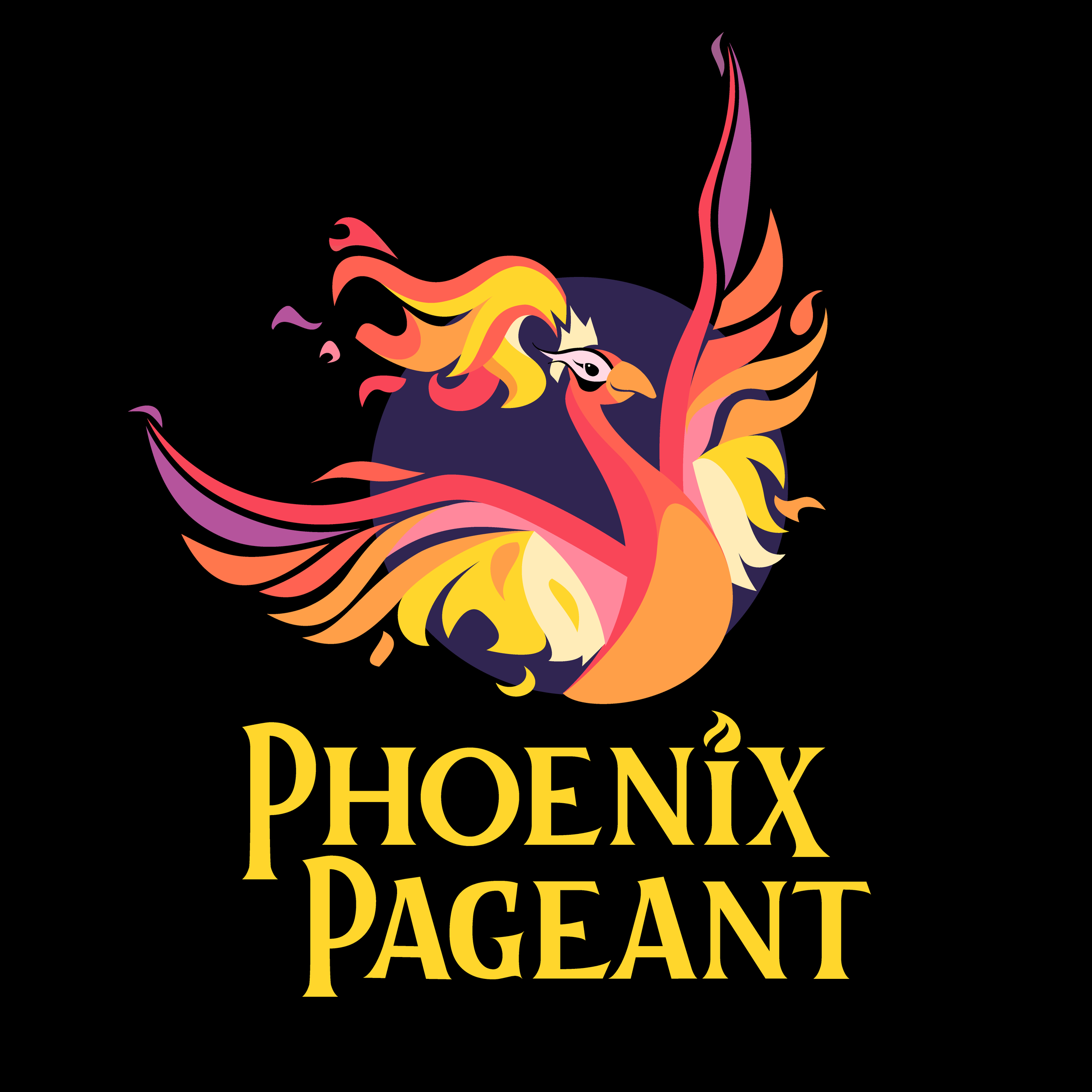
Phoenix Pageant logo
Phoenix Pageant is a California-based modern beauty pageant founded on feminist principles, which seeks to empower women by highlighting their inner beauty as well as outer beauty. The logo depicts the brightly flaming mythological phoenix in a distinctly feminine way.
Soar “Hamlet” logo
The “SOAR: Professional Training Program” is an after-school initiative for kids 13-18 through the Actors Theatre of Indiana. SOAR seeks to educate and empower young actors through master classes with Broadway and equity professionals. The logo itself is a simplified graphic of Shakespeare’s Prince Hamlet in a pose somewhat akin to the NBA logo, meant to symbolize teamwork and dedicated practice.
The logo can briefly be glimpsed in a local news piece by Indianapolis’ Channel 8 WISH TV. The full story can be seen here: https://www.wishtv.com/news/local-news/theater-program-is-helping-young-actors-soar-to-their-next-level/1775406989?fbclid=IwAR3XD96pC5E_rxYO0N_WnM7nnUvfF6t4fXnbiG8m3R0e5ICf2q7rYKTXik8
More direct information on the SOAR program, and how it helps young adults to become confident, empowered performers, can be read here: http://atistage.org/theatre-immersion-experience/
The Pound & The Fury logo
“The Pound & The Fury” was a short-lived law and politics podcast. It took a middle ground approach to hot-button issues, examining both the facts themselves and how modern society discusses them. The logo I created depicts two clashing speech bubbles coming from a smart tablet and a cell phone.
Students for Sustainability logo
Students for Sustainability was an extra-curricular program for High School students in central Indiana. Run by science teachers, the goal of the group was to teach habits and practices to help preserve nature. The logo is a simple graphic version of the Earth with trees, symbolizing the ubiquitous need for environmental consciousness.
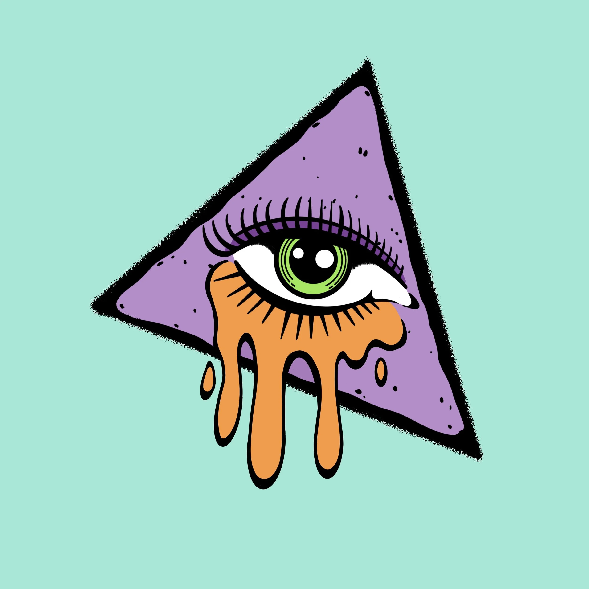
Hot Cheese Oddities “All-Seeing Eye” logo
Hot Cheese Oddities is a small-batch couture fashion brand out of Long Beach, California. The logo I came up with for them pushes their ‘odd & edgy’ brand with an All-Seeing Eye crying melted cheese.
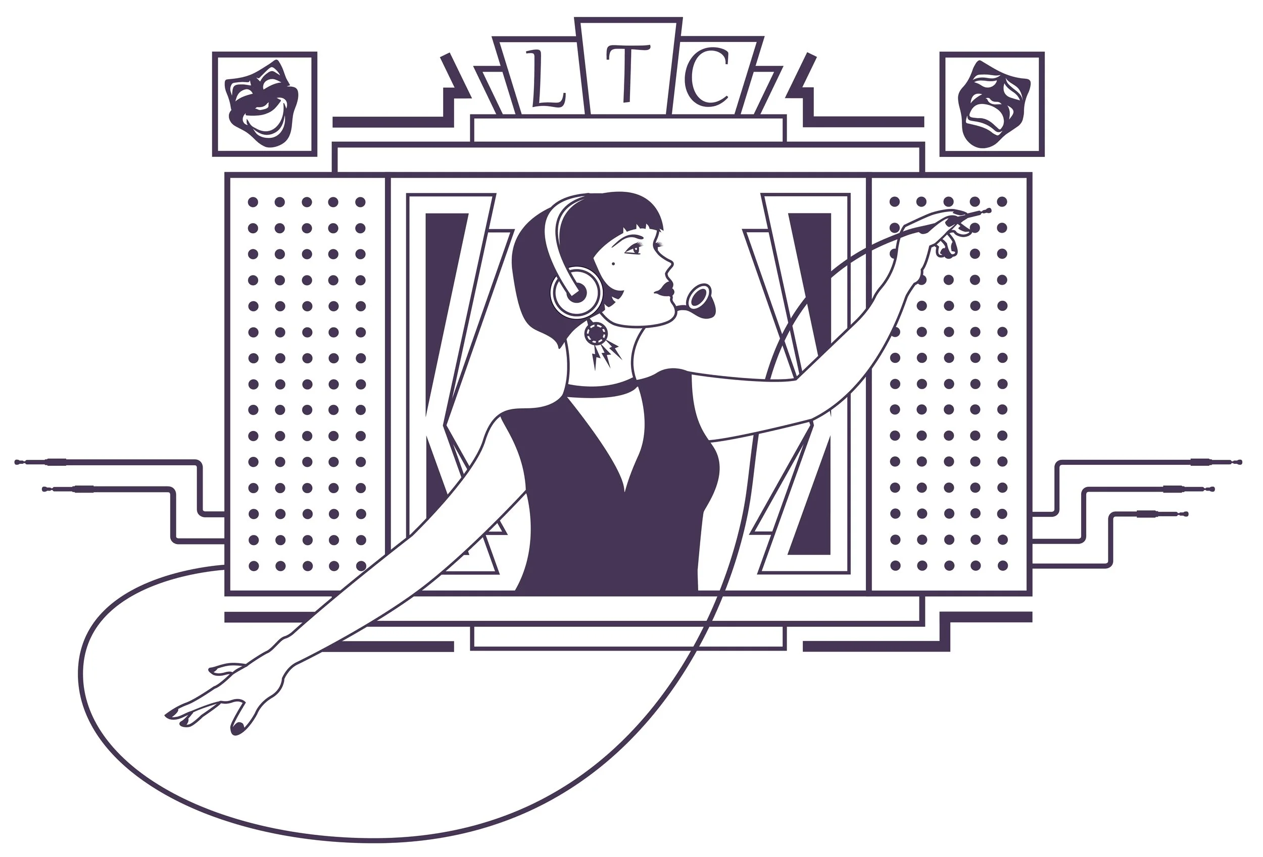
Lansing Theatrical Connection logo
The Lansing Theatrical Connection was an aborted project to create an organized collaborative body between the numerous community theaters in the Lansing, Michigan area. The logo design evokes both an early twentieth-century telephone switchboard and a theater proscenium.
unimPORTONt Productions logo
Created for Indy writer/director Lorne Porton, this logo is for her personal production company. The letters in ‘unimPORTONt’ are digital scans of letters struck by a 1950s Corona-Smith typewriter that I own.
High Seas Mariner Golden Spiced Rum bottle label
Done for fun, this is my stab at a vintage-style liquor bottle label that would look at home on a Mad Men bar cart. Bottoms up!
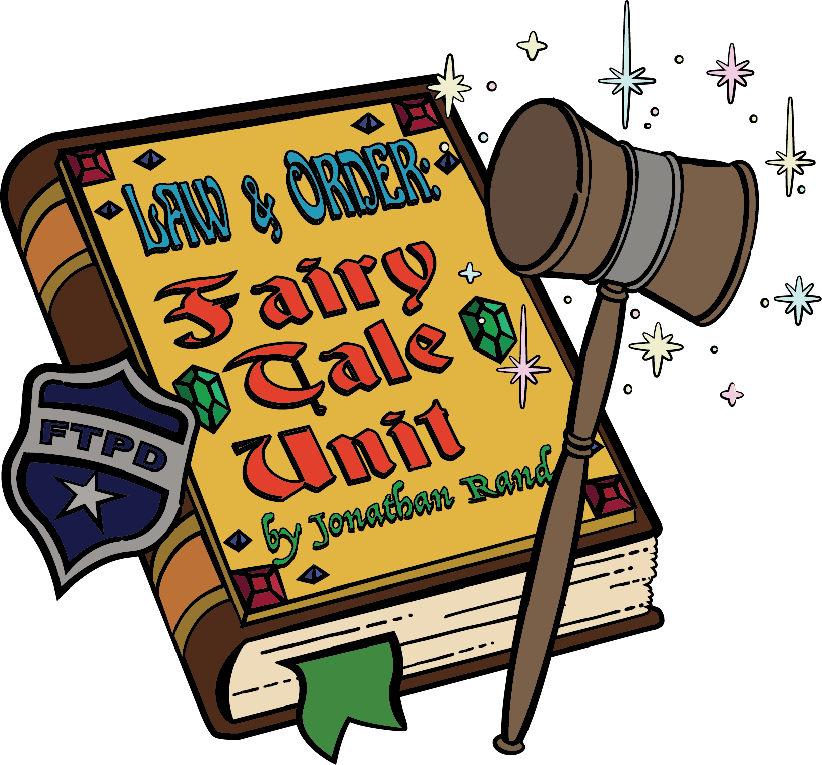
“Law & Order: Fairytale Unit” playbill design
“Law & Order: Fairytale Unit” is a popular play by Jonathan Rand, performed by school groups all over the country. I was commissioned to create this design for playbills, posters, and T-shirts for a specific production put on at Eagle Elementary School in Zionsville, Indiana.

